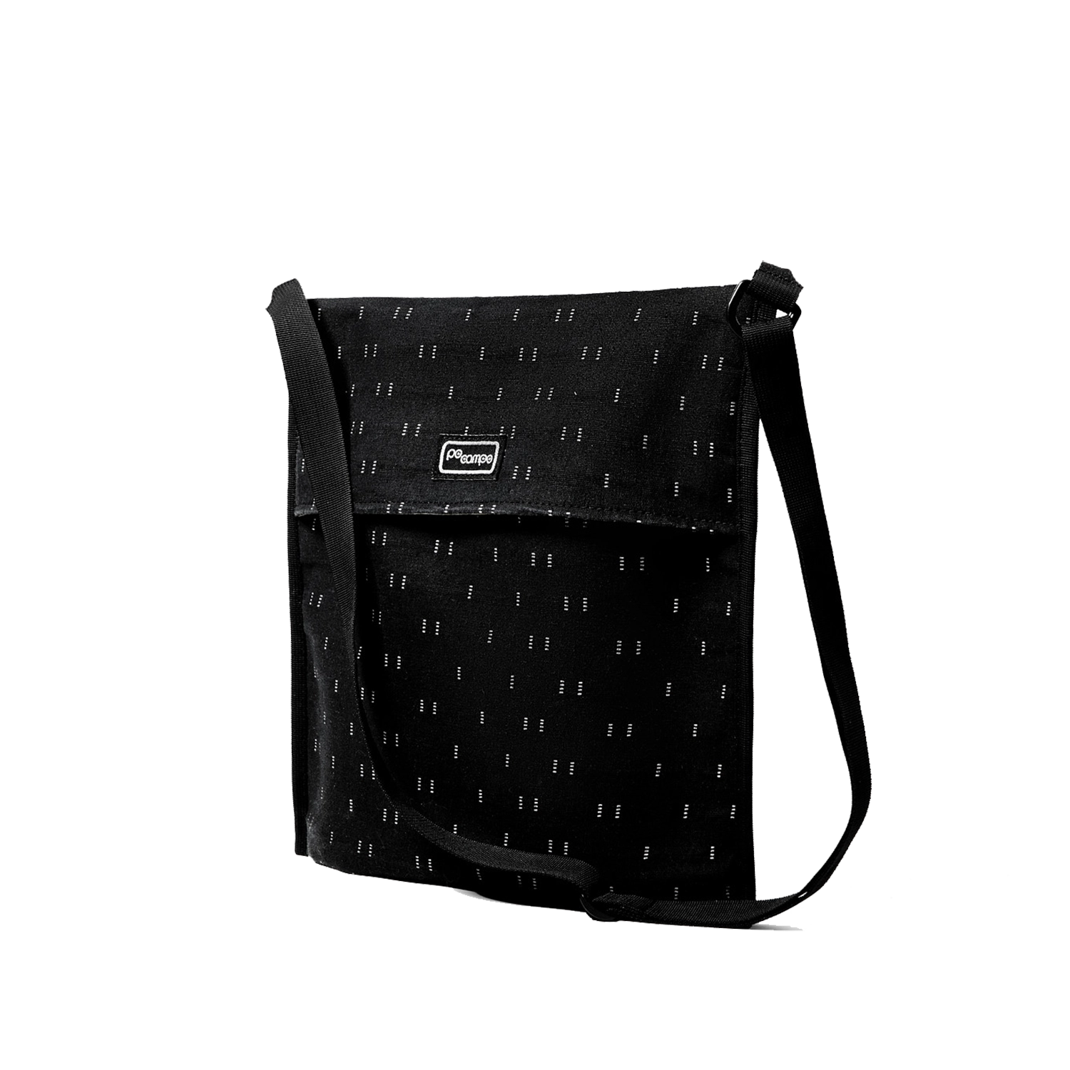
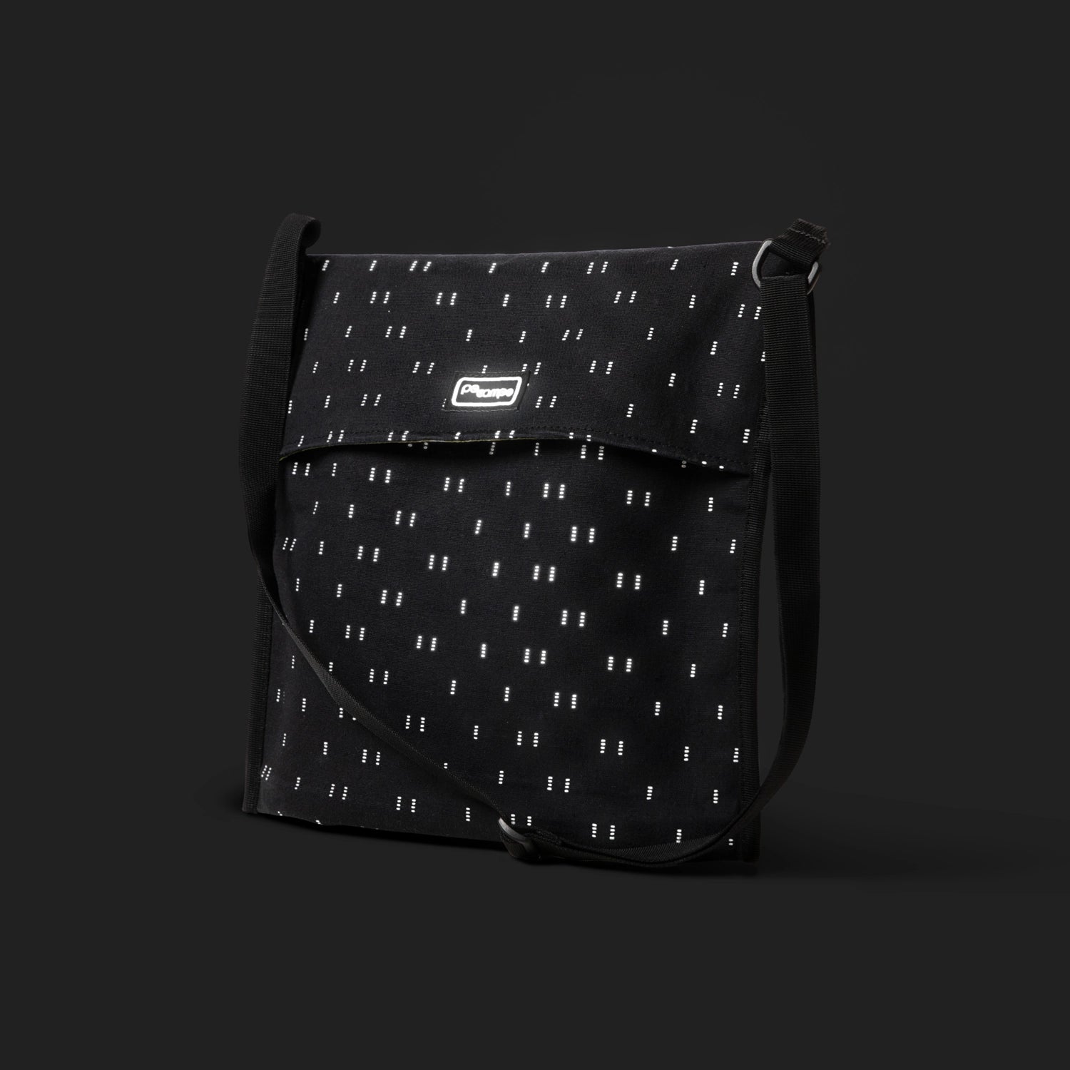
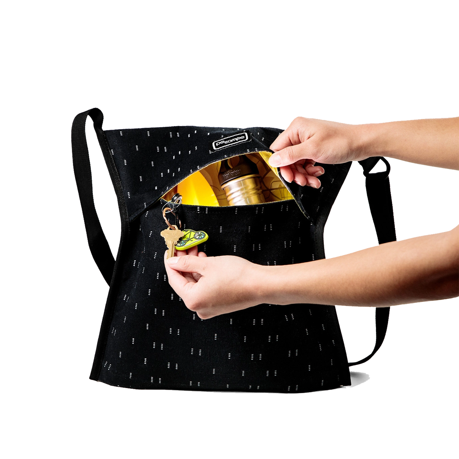
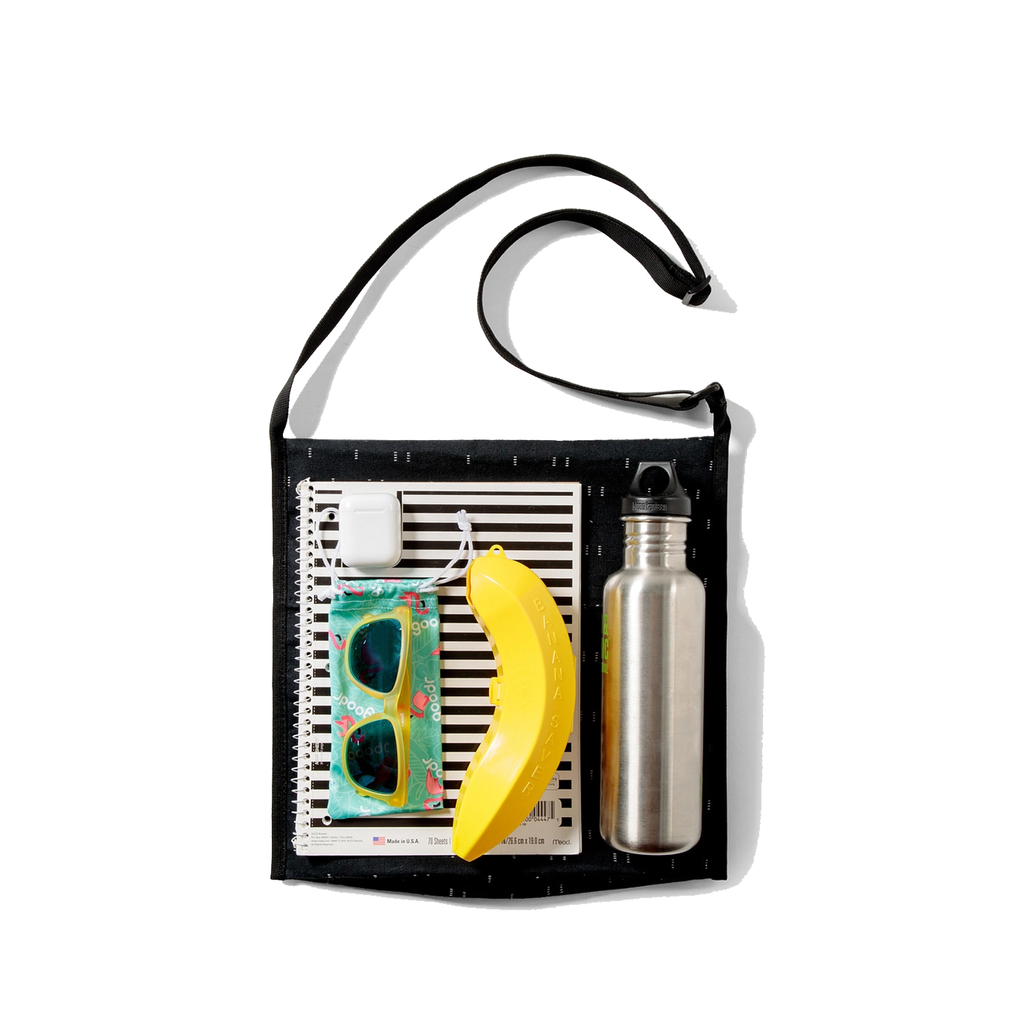
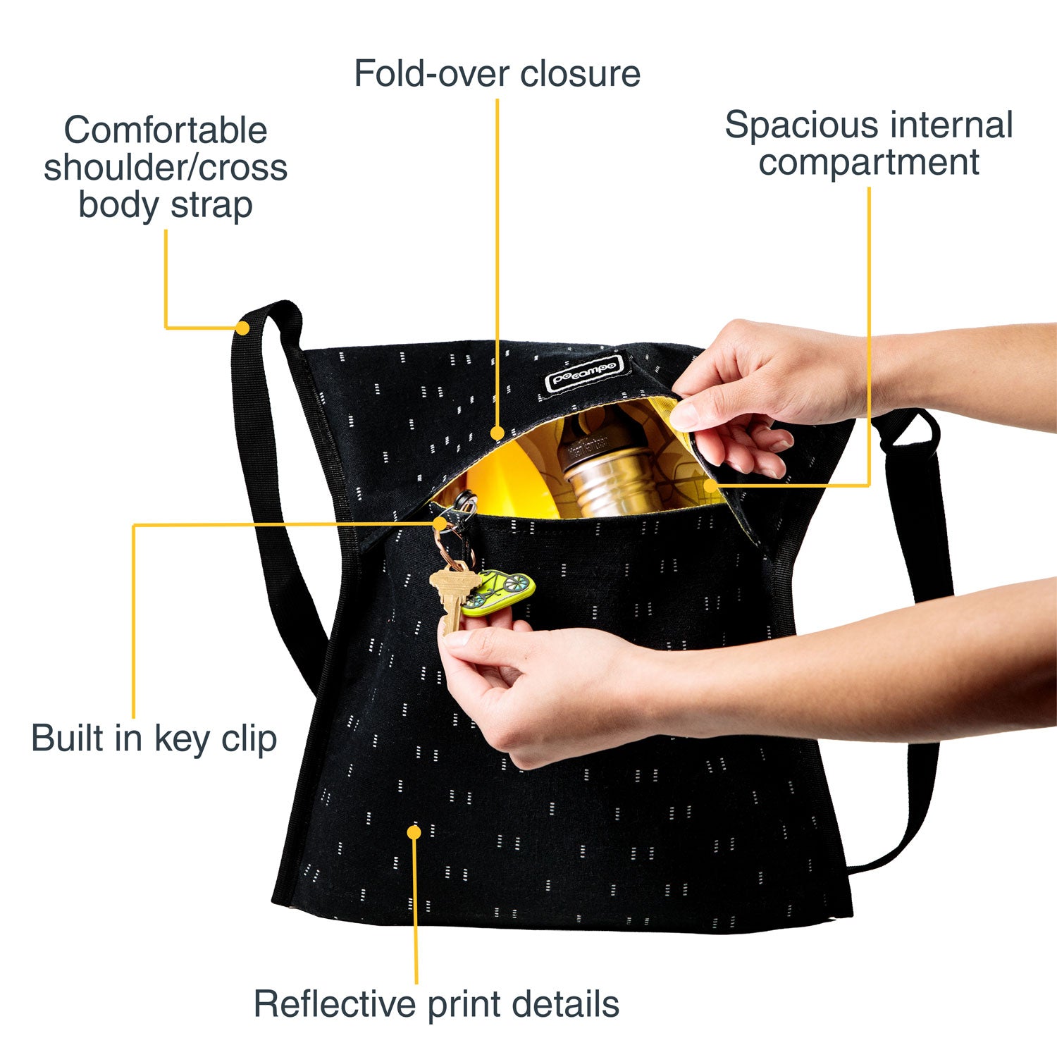
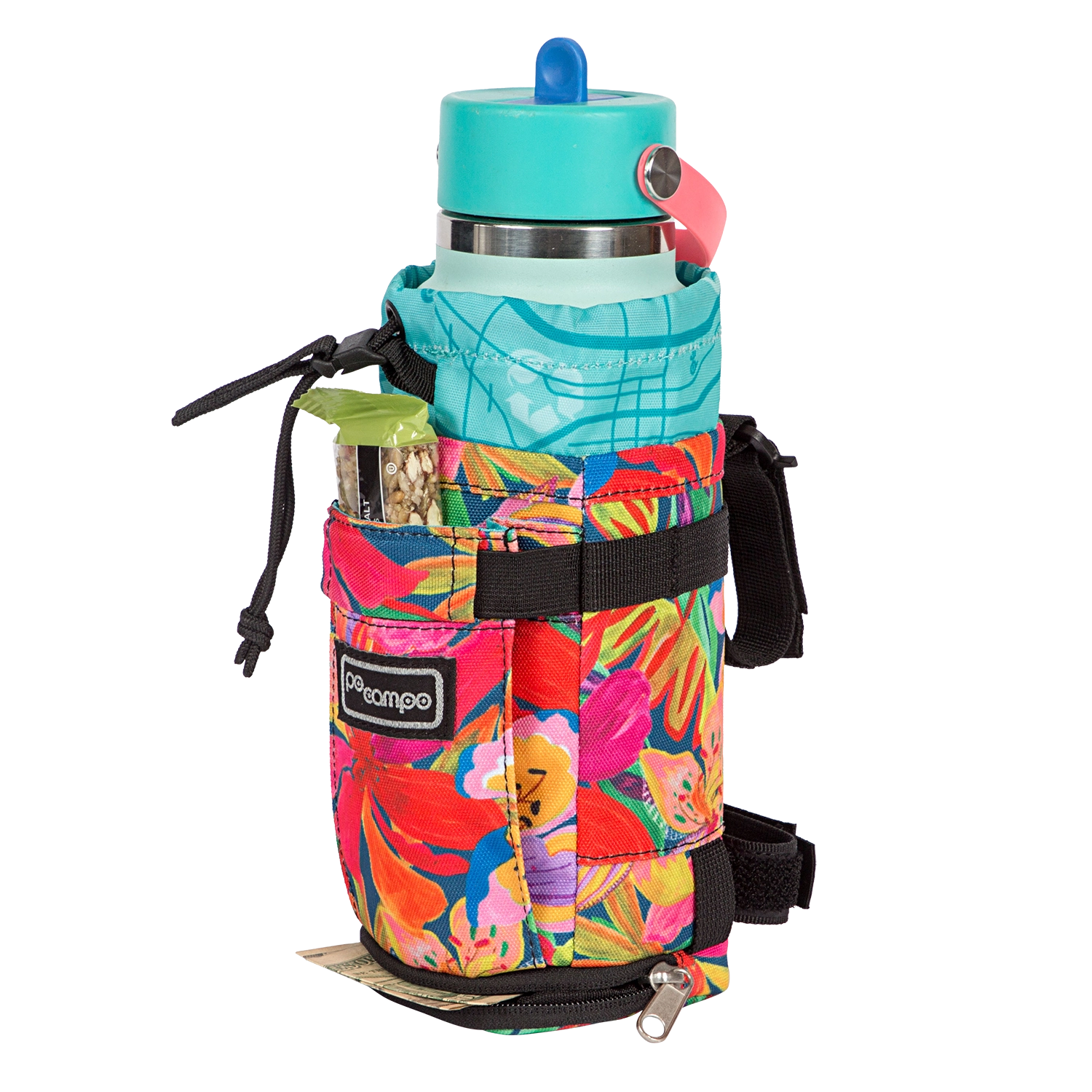
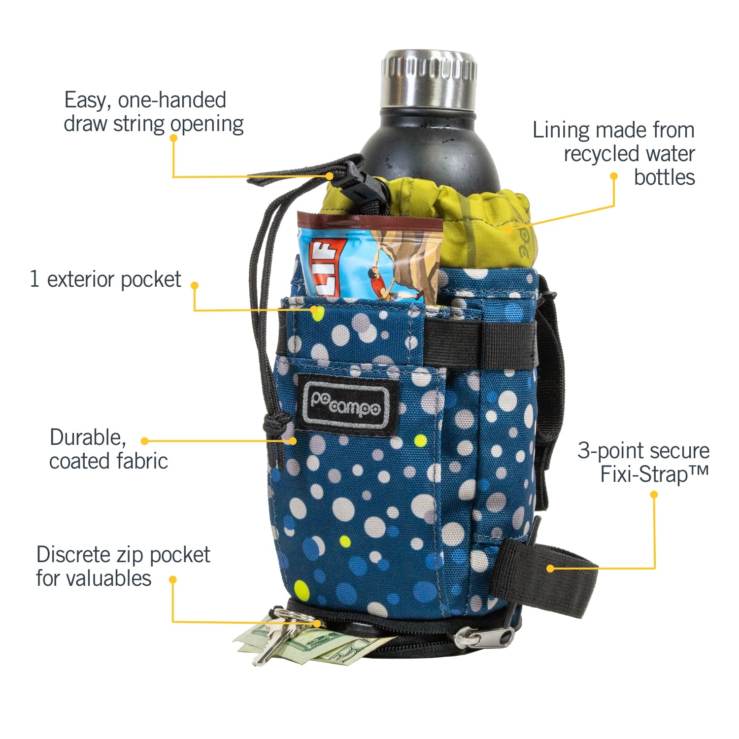
Our latest print, Checker, just launched and we’re super excited about it! It’s fun, it’s different and it’s perfect for kids and adults alike. We’re known for our fun prints and we often get asked how we create the design, so we thought we’d share some behind the print details about the process that went into designing Checker.

Every season Po Campo founder Maria Boustead and Head of Product Marty Crandall sit down to work on new patterns to introduce into the range. Maria researches trends, which Marty then uses to craft up mood boards and color palettes, often including a number of potential print patterns to license that fit within each mood and work well with our bags.
For Checker, Maria and Marty were particularly drawn to game inspired patterns that were featured in the trend boards. While none of these patterns quite hit the mark, they set the creative direction for Marty to run with and develop. The squares of the Checker prints were influenced by classic board games and digital pixels, with little Po Campo touches scattered throughout the pattern including the Po Campo bird that you’ll find in a couple of the squares.

“In our research we noticed that a lot of sophisticated brands are moving away from overt character prints such as dinosaurs or unicorns. Many kid's prints are simply whimsical and fun. We felt this technique lends itself to appealing to a wider age range - as well as parents.”
Once the Checker pattern was decided on and the color boards were set, the pattern was shared amongst a variety of family and friends of the brand as a trend test. From this, it was a pleasant surprise to discover that a number of parents and kids gravitated towards the green colors.

The earth tones are particularly fitting with the Fall release date while also hinting at the re-emergence of thrift culture in today's society. The cyber lime was added into the mix as a reference to the digital inspiration behind the print while the shades of green add an inclusivity to the print that all genders can resonate with.
On behalf of the Po Campo team, we hope you love Checker as much as we do and find fun and exciting adventures with this brand new Whoosh!